Reading your solar charts: what the numbers actually mean
kWh, kWp, Specific Yield, Performance Ratio, and Peak Power
Most solar dashboards show a similar set of charts. A bell curve of today's production. A bar chart of the last seven days. A year-on-year comparison. A summary of the kilowatt-hours produced this month. The numbers are accurate. The charts are well drawn. And most owners, two years into their installation, still cannot say with confidence whether their system is performing well, poorly, or as expected.
The reason is not laziness. It is that the standard metrics in solar are easy to read literally but harder to read meaningfully. "I produced 4,200 kWh this year" tells you very little on its own. The same number can mean a brilliantly performing 4 kWp system in Belgium, a slightly disappointing 5 kWp system in Spain, or a struggling 6 kWp system in either country. The headline kilowatt-hours hide the comparisons that actually matter.
This article walks through the metrics that turn a row of numbers into a useful diagnostic. None of these are new ideas. All of them appear in PVOutput's reports, in inverter manufacturer apps, in HelioPeak's chart views, and in any half-decent monitoring tool. What is often missing is the connecting tissue that explains what each metric means and when it matters. Let me try to fill that in.
The fundamental distinction: kWh and kWp
If you remember nothing else from this article, remember this. kWh measures energy. kWp measures power. They sound similar, they are written similarly, and they describe two completely different things.
Power is the instantaneous rate at which electricity is being produced or consumed, measured in kilowatts. The peak power of your inverter is, for example, 5 kW. Your kettle draws 2 kW while it is heating water. Your roof, on a perfect summer noon, might be sending 4.5 kW from the panels to your home. These are all instantaneous numbers, frozen at a single moment.
Energy is power accumulated over time, measured in kilowatt-hours. Run a 2 kW kettle for half an hour and you have consumed 1 kWh. Run a 4 kW solar array for six hours of average sunshine and you have produced 24 kWh. The kilowatt-hour is the unit your electricity bill is denominated in, and it is the unit that PVOutput and almost every solar app uses for headline totals.
The "p" in kWp adds one more wrinkle. It stands for "peak" and refers to the manufacturer's rated output of your panels under ideal laboratory conditions: 1,000 watts per square metre of irradiance, 25°C cell temperature, and a perfectly clean panel facing the sun head-on. A 4 kWp system is a system whose panels, summed up, are rated to deliver 4 kW under those laboratory conditions. In real life on a Belgian roof, the system might produce 4 kW for perhaps half an hour around solar noon on a clear May day, and substantially less the rest of the time.
This distinction matters because the standard performance metric in solar is the ratio of the two, expressed as kWh per kWp per year. That ratio, called specific yield, is where the actual comparison lives.
Specific yield: the universal benchmark
Specific yield divides your annual energy production (in kWh) by your installed panel capacity (in kWp). The result, in kWh per kWp per year, lets you compare any solar installation to any other regardless of size.
A 4 kWp system producing 3,600 kWh in a year has a specific yield of 900 kWh/kWp/year. A 10 kWp system producing 9,000 kWh in the same year has the same specific yield of 900. Both systems are performing identically relative to their installed capacity. The 10 kWp system produces more energy in absolute terms, simply because it has more panels.
The typical specific yield ranges for residential systems map roughly to climate zones:
- Northern Europe (Belgium, Netherlands, Germany, UK, southern Scandinavia): 900 to 1,150 kWh/kWp/year
- Central Europe (France, central Germany, northern Italy): 1,100 to 1,300 kWh/kWp/year
- Southern Europe (Spain, southern Italy, Greece, Portugal): 1,400 to 1,700 kWh/kWp/year
- Excellent solar regions (southwestern US, North Africa, Middle East, Australia): 1,700 to 2,200 kWh/kWp/year
A Belgian household whose 6 kWp system produced 5,800 kWh last year has a specific yield of about 970, which is fine. A Belgian household whose 6 kWp system produced 4,500 kWh has a specific yield of 750, which is low and worth investigating. The same 4,500 kWh on a 4 kWp system in the south of France would be a specific yield of 1,125, which is fine for that location.
This is why headline kWh totals are so misleading on their own. A friend in Andalusia bragging about producing 8,000 kWh from their 5 kWp system is performing at a specific yield of 1,600, while a friend in Antwerp quietly producing 5,500 kWh from their 5 kWp system is performing at 1,100. The Belgian system is doing slightly better relative to its conditions. The Spanish system has better conditions and is making good use of them. Neither is "better" without context.
A useful habit is to write down your expected annual specific yield at installation time, based on PVGIS calculations or your installer's quote, and to compare your actual yield against it each year. Underperformance of 5 to 10% is normal and usually explainable (a cloudier year, a few weeks of shading from a neighbour's tree, light soiling). Underperformance of 15% or more for two consecutive years is a signal that something is wrong, and the data above tells you when to start asking questions.
Performance Ratio: the system health metric
Specific yield mixes two things together: how good the location is, and how well the system is performing. The location you cannot change. The system performance you can sometimes improve. The metric that separates these two concerns is the performance ratio, abbreviated PR.
Performance ratio asks: of the energy that fell on the panels, how much made it through the inverter and out to the grid as usable electricity? It is calculated by comparing your actual production to the theoretical maximum given the irradiance that hit your panels. A well-designed, well-maintained residential system in 2026 has a PR between 0.80 and 0.90. Anything below 0.75 is poor. Anything above 0.90 is exceptional.
The PR captures all the losses between the sunlight hitting the panels and the energy arriving at your meter. These include panel temperature losses (cells produce less when hot, which is why a cool clear March day often outperforms a hot July day), inverter conversion losses, wiring losses, mismatch losses between panels in a string, soiling losses (dust, pollen, bird droppings), and degradation over time (panels lose roughly 0.5% capacity per year).
Most consumer apps do not show PR directly because it requires irradiance data from a nearby weather station to calculate. Some advanced platforms calculate it automatically when you have a weather sensor on the same network. For most home users, PR is more useful as a concept than as a number you check daily: if your specific yield is declining over years and you cannot blame the weather, the underlying issue is almost certainly a falling performance ratio.
Peak Power: the maximum the system reaches
Peak Power is exactly what it sounds like: the highest instantaneous power your system produces in a given period, usually a day. It is measured in watts or kilowatts and represents the brief moment when conditions align perfectly.
For a south-facing system at the optimal tilt, peak power usually occurs around solar noon on a clear day in April or May. The cells are still cool, the sun is high, the panels are clean from spring rain, and the irradiance briefly approaches the 1,000 W/m² used in the kWp rating. A 5 kWp system on such a day might hit a daily peak of 4.6 to 4.9 kW, briefly. By July, the same system on the same clear day might only peak at 4.2 to 4.4 kW because the cells are running 30°C hotter.
What peak power tells you, when tracked over time, is the health of your panels and the cleanliness of your roof. The annual peak should be consistent year over year, give or take a percent for normal degradation. A sudden drop in peak power between one spring and the next, without any obvious cause, is worth investigating. It can mean a panel has failed, a string has gone offline, or something is shading the array that was not there last year.
This is one of the metrics where having a longer history is genuinely useful. With five years of data, the year-on-year peak power chart becomes a diagnostic: a stable line means everything is fine, a stepwise drop means something changed at that specific moment. HelioPeak's annual report PDF includes this comparison automatically, alongside specific yield and the headline kWh totals, because the three together tell more of the story than any one of them alone.
The shape of the daily curve
Beyond the headline numbers, the actual shape of the daily production curve carries information that is easy to miss until you start looking.
A symmetric bell curve, peaking smoothly at solar noon, suggests a south-facing array with no shading and uniform panel performance throughout the day. This is what your installer's simulation showed and what you might expect on a perfect day.
A flat-topped curve, where production peaks early and stays at a plateau for several hours, is the signature of inverter clipping. If your array is oversized relative to the inverter (a DC/AC ratio of 1.3 or higher), the inverter caps the output at its rated maximum during the brightest hours. This is normal and usually intentional, but it is worth knowing what you are looking at.
An asymmetric curve, peaking either before or after solar noon, suggests the array is not facing due south. Panels facing southeast peak earlier; panels facing southwest peak later. East-west arrays produce two smaller peaks rather than one big one. None of this is a problem, but the curve should be predictable.
Dips and notches in the middle of an otherwise smooth curve are usually shading. A passing tree branch at 10:30 every morning, a chimney shadow at 14:00 in winter, a temporary scaffolding on the neighbour's roof, all show up as repeatable dips in the daily curve at the same time of day, week after week. Catching these early and clearing the obstruction is one of the better returns on time you can get from solar monitoring.
Cloudy days produce a noisy, irregular curve that can dip and rise dramatically over minutes. This is normal, and the daily total is what matters, not the second-by-second variability.
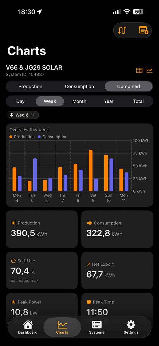
Year-on-year comparisons
Once you have more than a year of data, the most useful chart is often the simplest: this year's monthly totals laid on top of last year's. Modern apps render this as two coloured lines on a calendar, with the running totals shown alongside.
What you are looking for is whether the lines roughly match. Solar production varies by 10 to 15% from year to year purely due to weather: a sunny April can produce more than a cloudy May, and a single rainy fortnight in midsummer can drop a year's total by several hundred kilowatt-hours. So month-by-month comparisons are noisy, and a single month being down by 20% might mean nothing more than the weather was bad that month.
The trend over the full year is what matters. If 2026 is tracking 5% below 2025, that is normal variance. If 2026 is tracking 15% below 2025 with no obvious weather explanation, something is up. The diagnostic instinct is to look at month-by-month or week-by-week to find when the divergence started, and then think about what changed at that moment. New construction blocking the sun? A panel that finally failed? A firmware update that introduced a bug?
The calendar heatmap view, where each day in the year gets a coloured square based on its production, makes this kind of pattern-spotting easier than line charts can. A patch of unexpectedly dim squares in late July immediately stands out against the surrounding bright ones, and prompts the obvious question of what was different that week.
Production versus consumption: the band that matters
For households with consumption monitoring (which we covered in Setting up consumption monitoring), the most useful chart is the one that overlays the two curves on the same axis.
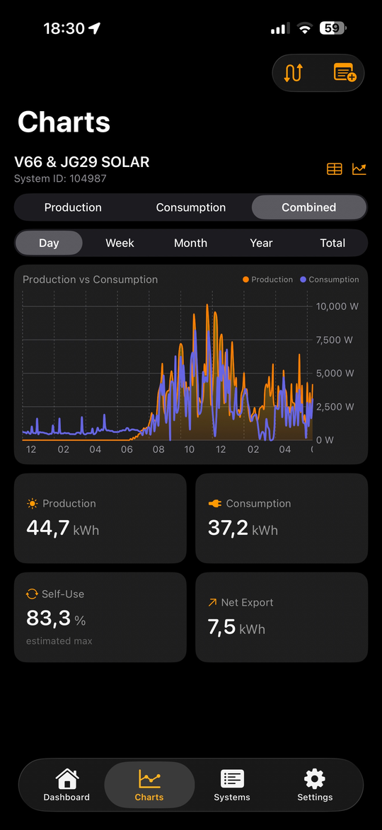
Production rises in the morning, peaks at midday, falls in the afternoon. Consumption typically has two smaller humps, one in the morning when the household wakes up and starts breakfast, and one in the evening when everyone is home and cooking. The band between the two curves, when production exceeds consumption, is your self-consumption opportunity. The band when consumption exceeds production is grid import.
The two bands together tell you, in a single picture, where the optimisation potential lies. A household with a tall morning consumption hump and a tall evening hump but a thin midday valley is getting good self-consumption naturally. A household with a midday peak in production but a flat consumption profile all day is exporting most of its solar back to the grid. The first household needs little intervention. The second household has room to shift loads into daylight hours, install a battery, or rethink behaviour.
Watching this chart change shape over a year is one of the more rewarding parts of running a solar installation. The summer pattern, with the production curve dwarfing the consumption curve, is different from the winter pattern, where consumption usually exceeds production for most of the day. Both are normal. Both repay attention.
When the numbers tell you something is wrong
There are a few specific patterns worth knowing about as warning signs.
Sudden drops in daily production with no weather explanation usually mean a string or a panel has gone offline. Inverters with string-level or panel-level monitoring will flag this directly. Inverters without that capability show up as a step-function drop in the daily curve shape, where the peak power is now noticeably lower than the previous week's.
Gradual decline of more than 1% per year beyond normal degradation is worth investigating. Panels lose 0.5% to 0.7% per year as a normal part of ageing. A 2% decline year on year suggests something is accelerating the degradation: soiling that does not wash off in rain, partial shading, or a panel-level issue.
Production lower than expected on bright clear days but normal on cloudy days can indicate inverter clipping or string mismatch. If your peak power has dropped but your low-light performance is unchanged, the issue is at the top end of the curve, which usually points to either the inverter or to a single failing panel pulling down a string.
Consistent underperformance versus PVGIS or your installer's estimate is more often a sign that the original estimate was optimistic than that the system is broken. Installer estimates are sometimes generous to close the sale. PVGIS is more conservative but still assumes ideal conditions. A working system in Belgium that produces 85 to 95% of the PVGIS estimate is generally fine.
For all of these, the diagnostic path is the same: rule out weather first, look at the year-on-year trend, then drill into the specific period where the divergence started, and only then bring in the installer. Half of the support calls solar installers receive are people seeing seasonal variation and panicking. The other half are real issues that the data, read carefully, identifies long before the symptoms become catastrophic.
A small piece of advice
If you take one habit away from this article, make it the year-end review. Once a year, look at your specific yield versus the previous year, your peak power versus the previous year, and your year-on-year monthly chart for any unexpected divergences. Write down what you find somewhere you can revisit it next year.
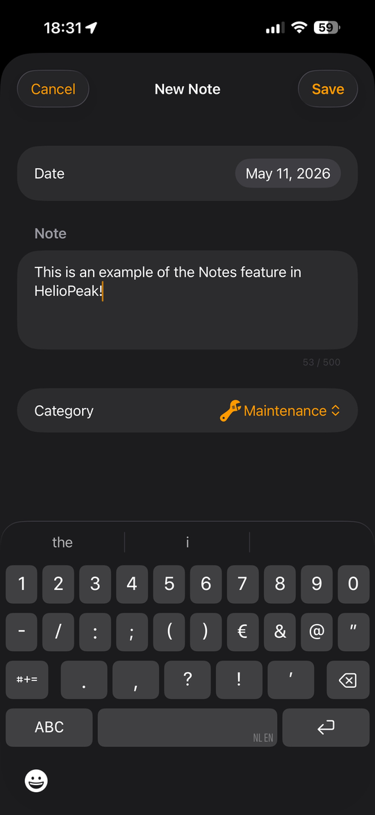
One option for that "somewhere" is HelioPeak's Notes feature. The app lets you attach a short text note to any specific date in your production history, and the note then appears as a small badge on the chart at that date whenever you look at it again. The original idea was to let owners record events that affect production: the day the panels were cleaned, the morning the inverter was rebooted, the week of the heatwave that suppressed output. The same mechanism works equally well as a year-end journal entry: a note on the system's anniversary date summarising the year's specific yield, peak power, and anything unusual you noticed. Next year, when you scroll back to that date, the badge is there and the comparison writes itself. A calendar reminder or a paper journal works just as well; what matters is that the observation outlives the moment you made it.
Mention any concerns to your installer at the annual maintenance visit, if you have one, or just keep them in mind for next year's comparison.
Most years, the review will take ten minutes and confirm that everything is fine. Some years, it will catch something early, when the fix is cheap and the lost production is small. That is the actual value of monitoring: not the daily glance, satisfying as it can be, but the long-term comparison that lets you know whether the asset on your roof is still doing the job you bought it to do.
HelioPeak's annual report PDF, generated each year on the system's anniversary, was built specifically around this habit. It assembles the key metrics into a single document you can save, print, or email to your installer if you have concerns. The PVOutput web interface offers similar reports in its statistics views, and other monitoring tools have their own versions. The format does not matter much. The habit of looking once a year, in a structured way, is what makes the difference.
After that, you can go back to glancing at the widget on the lock screen and feeling vaguely satisfied that the sun is doing its job. Which is, after all, the actual reason for going solar in the first place.