Why a smartphone app changes how you understand solar production
The dashboard problem, behavioural effects, and the case for ambient awareness
Most solar panel owners have had a version of the same experience. Sometime in the second or third year, they look at the inverter's web portal, scroll through the daily totals, and realise they have been blindly trusting a number for a long time. The kilowatt-hours that flicker across the manufacturer's app screen are abstract. They are big enough to feel reassuring, and small enough to never quite become a story. The number goes up, mostly. The bill goes down, sometimes. Whether the system is doing well or doing badly is anybody's guess.
This is, quietly, one of the more interesting problems with home solar. The data exists. It is being recorded. It is sitting on some inverter manufacturer's server in Frankfurt or Tel Aviv. But the relationship between the numbers and the household is broken, and a desktop dashboard you check once a month does almost nothing to fix it. A smartphone app does, and not for the reasons you might expect.
The dashboard problem
The conventional way to look at solar data is what most inverter manufacturers ship by default: a website you can log into, with a dashboard, a chart, a couple of summary boxes, and an export button buried somewhere in a menu. It is fine. It is also slow, often poorly designed, full of upsells for premium tiers, and built for the kind of person who sits at a desk and remembers to check it on a Sunday morning.
The trouble is that solar data is intrinsically time-bound. A kilowatt-hour you produced at 11am yesterday is interesting only if you can connect it to what you did at 11am yesterday. Was the dishwasher running? Were the kids home from school? Did the heat pump kick in? The longer you wait to look at the data, the more the context decays. By the time you log in three weeks later, you are looking at numbers without the memory to make sense of them.
This is the core reason a phone matters. It is not that the screen is brighter or the charts are prettier. It is that the data lives in your pocket, and you can glance at it in the moments where the data and your behaviour intersect. The fundamentals of solar monitoring did not change when smartphones became powerful enough to render real-time charts. Our access to the moments where monitoring matters did.
What changes when the data is in your pocket
A few things happen, slowly, in the weeks after you start checking solar data on your phone.
The first is that you begin to notice patterns you never had time to notice before. The morning peak on a clear April day is sharper than the same peak in July, because the panels are cooler and run more efficiently. A row of cloudy days produces a rolling-hill curve instead of the bell shape you have come to expect. A passing aeroplane casts a momentary shadow. A bird, occasionally. Not all of this matters individually, but the aggregate effect is that you stop seeing your installation as a black box and start seeing it as a system you can read. That shift is the actual value.
The second thing that happens is that you start changing behaviour without thinking about it. The dishwasher gets pushed to noon. The washing machine goes on at 2pm instead of 8pm. You learn to anticipate the day's production from the morning weather forecast and decide, half-consciously, whether today is a good day to charge the car at home or wait for the cheap night-time tariff. None of this is hard or technical. It is the kind of subtle, daily adjustment that emerges when information is close at hand and slightly disappears when it is not. Behavioural research on health apps has documented this effect for over a decade, where over 80% of users of self-monitoring apps report increased awareness leading to behaviour change without explicit goal-setting. The mechanism for solar is the same: visibility breeds attention, and attention breeds adjustment.
The third thing, and the one most people are surprised by, is that you stop checking the app. Not entirely, but the obsessive first month tapers into a kind of background awareness. You glance at the home-screen widget on the way to make coffee. You notice when the daily total looks low for the weather, and you investigate. You ignore it on days when the answer is obvious. The app becomes a kind of tool for noticing things, rather than a thing you spend time inside.
The widget question
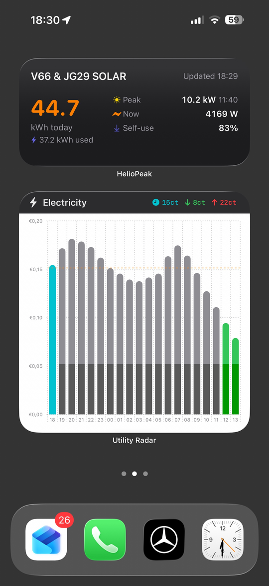
Among the most underrated features of any solar app is the widget. A widget on a home screen or lock screen does something a website fundamentally cannot: it makes the data ambient. You see today's production curve as a faint sparkline next to the weather forecast and the calendar, every time you unlock the phone, without ever opening anything.
The behavioural effect of an ambient data display is much larger than the time investment suggests. Smart watches did this for fitness data. Home thermostats did it for temperature. The same logic applies to solar. The number you see fifty times a day in passing teaches you the seasonal rhythm of your installation in a way no monthly summary email ever could. By the end of the first year, you can tell a 28 kWh day from a 32 kWh day at a glance, just from the shape of the morning curve, without checking any actual numbers.
This is also where the limits of the manufacturer apps become apparent. Most still treat widgets as an afterthought, with one or two static layouts that show a number and a percentage. The good independent apps treat the widget as a first-class citizen, and the difference shows in everyday use.
The independent app perspective
There are essentially two categories of solar apps for a phone. The first is the manufacturer app, made by SMA, Fronius, SolarEdge, GoodWe, Enphase or whoever sold you the inverter. These are competent, free, and do what they need to do for the basic case. They also tend to lock you into one ecosystem, change their feature sets without warning, and treat your historical data as something they own rather than something you own.
The second category is the independent app, which sits on top of an open data platform like PVOutput.org. HelioPeak, the iOS app I work on, falls in this category, but there are others. The defining advantage is that the app is decoupled from the inverter brand. If you switch from a SolarEdge to a Fronius next year, the app keeps working and the history comes with you. If the manufacturer's cloud goes through a price hike or a feature regression, your monitoring is unaffected. This is sometimes called platform independence, and it is increasingly the conscious choice of households who have been burned at least once by a manufacturer changing the rules.
There is also the design dimension, which is harder to quantify but easy to feel. Manufacturer apps are usually designed by hardware companies as a software afterthought. The result is functional but rarely a pleasure to use. Independent apps tend to be made by small teams or solo developers who are themselves solar owners, who understand the daily friction of looking at the data, and who care about the small things: how a chart axis renders on a small iPhone, whether the widget updates fast enough, what happens when the network drops, how a year of data exports as a single PDF. This sounds like nitpicking until you have used both and felt the difference.
A note on price awareness
In 2026, there is a layer of complexity that did not exist a few years ago: the question of when solar production is most valuable. As we covered in the previous article, self-consumed solar is several times more valuable than exported solar in most of north-western Europe. Households on dynamic price contracts have the additional question of when wholesale prices are favourable.
A good solar app does not need to solve this problem on its own. But it does need to give you the data that lets you solve it yourself. Knowing that you produced 18 kWh on a Tuesday is one fact. Knowing that you produced 18 kWh, used 6 of them yourself, and exported 12 at €0.04 per kWh while the wholesale price for the day was actually averaging €0.11 is a much richer fact. The first number ends with a shrug. The second number ends with a plan.
This is why the better apps are increasingly looking at how to surface consumption data, comparison data, and contextual data alongside the basic production curve. The future of solar monitoring is not about adding more numbers. It is about making the numbers you already have actionable in the moments where decisions get made.
The technical bit
For the technically inclined, the architecture of a solar monitoring app is more interesting than it sounds. A typical iOS app of this sort needs to handle three distinct rhythms of data, and they all behave differently.
The first rhythm is real-time, where the app polls a remote API every five to fifteen minutes during daylight hours to pull the latest power readings. The polling has to be aggressive enough to feel live, but gentle enough to respect the rate limits of the underlying platform. PVOutput, for instance, allows around 60 calls per hour for non-donating accounts, which sounds generous until you realise an app with widgets, a complications-enabled Apple Watch face, and an intraday detail view might consume that allocation in a few hours of casual use. The clever solution is local caching, batching, and asking only for the deltas when possible.
The second rhythm is the daily archive, where the app fetches end-of-day totals once per day and stores them in a local SQLite database for offline access. This is the data that powers the year-on-year comparisons, the monthly stats and the long-term trends. It is bulky, slow-changing, and benefits enormously from being kept on the device rather than fetched on every request.
The third rhythm is historic backfill, which is the awkward case where someone installs the app for the first time and wants to see five years of history immediately. PVOutput's getoutput.jsp endpoint returns at most 149 records per call regardless of what limit you request, so the app has to chunk the request into roughly 120-day windows, fire them sequentially while respecting rate limits, and stitch the results into a single timeline. None of this is technically difficult, but the difference between an app that handles this gracefully and one that times out or shows confusing loading states is significant in user experience.
The reason any of this matters is that the smoothness you feel when scrolling through five years of solar data on a phone is not free. It is the sum of a thousand quiet engineering choices, mostly invisible, and the visible result is that the data is simply there when you ask for it. That is, in the end, the whole point of putting solar in your pocket.